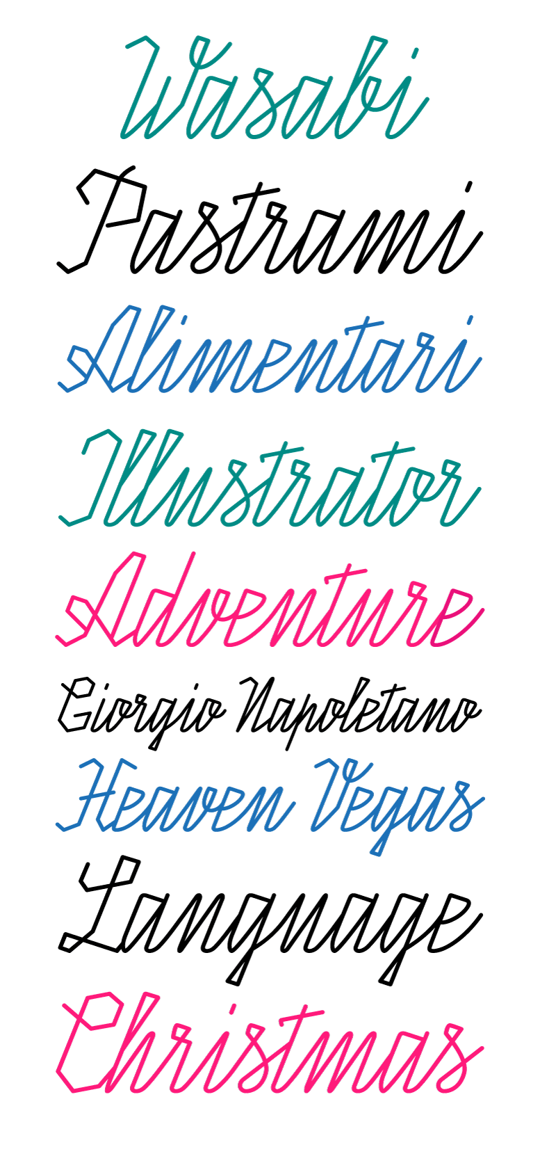
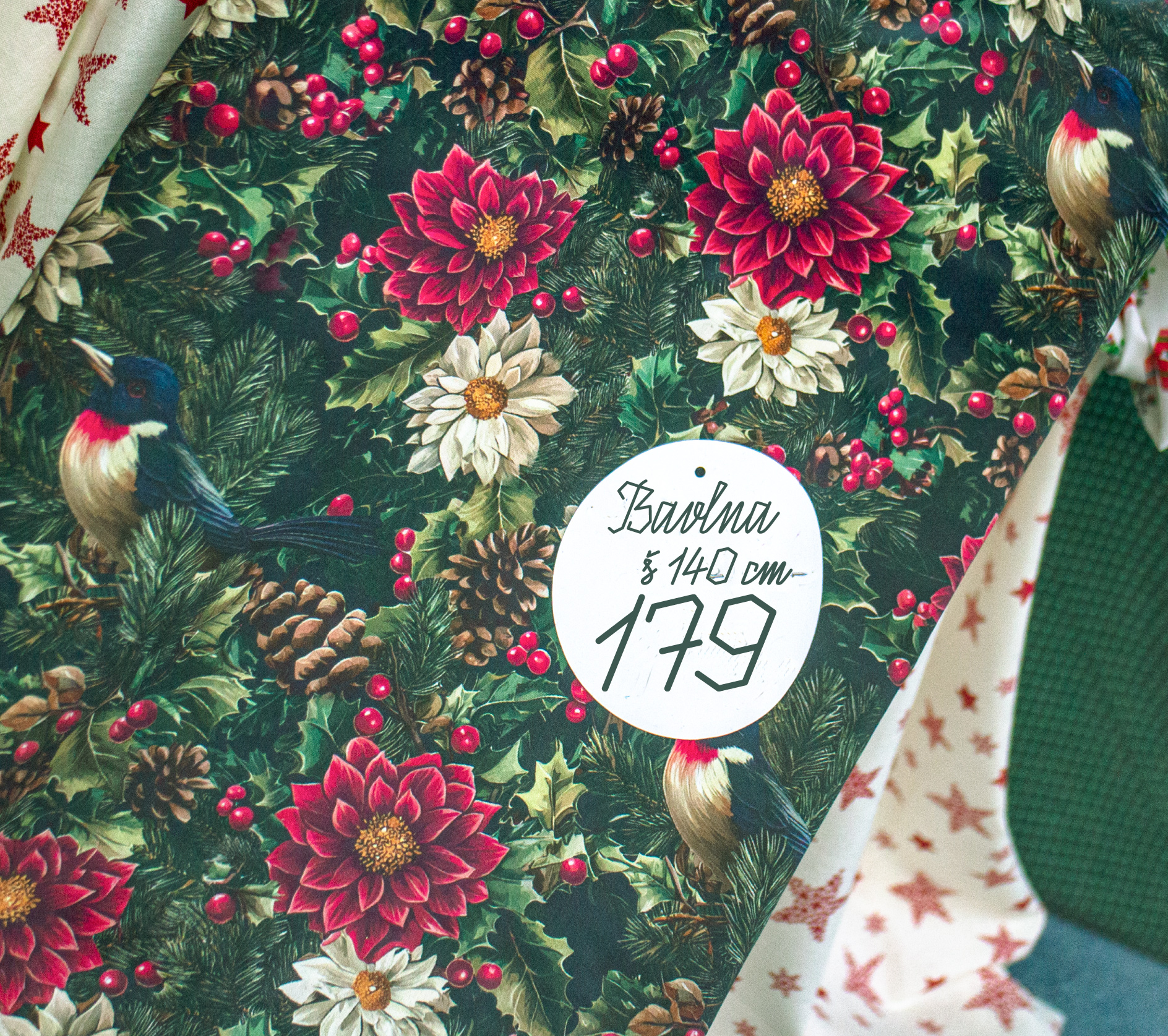
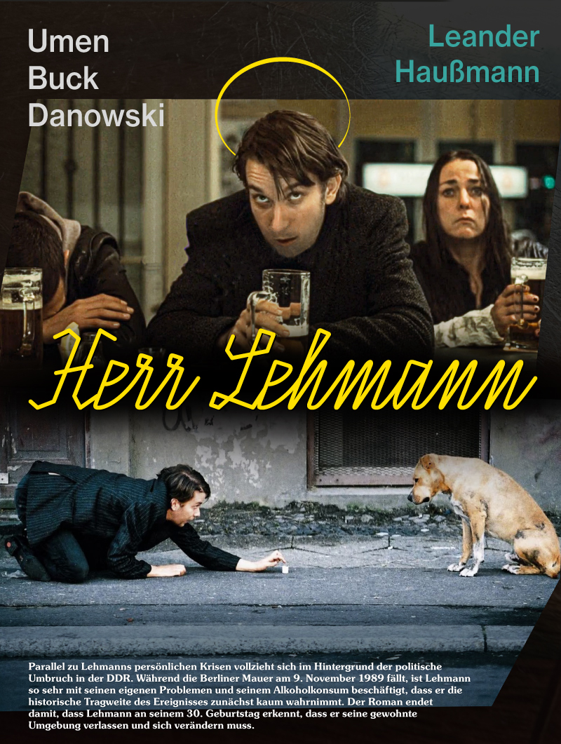
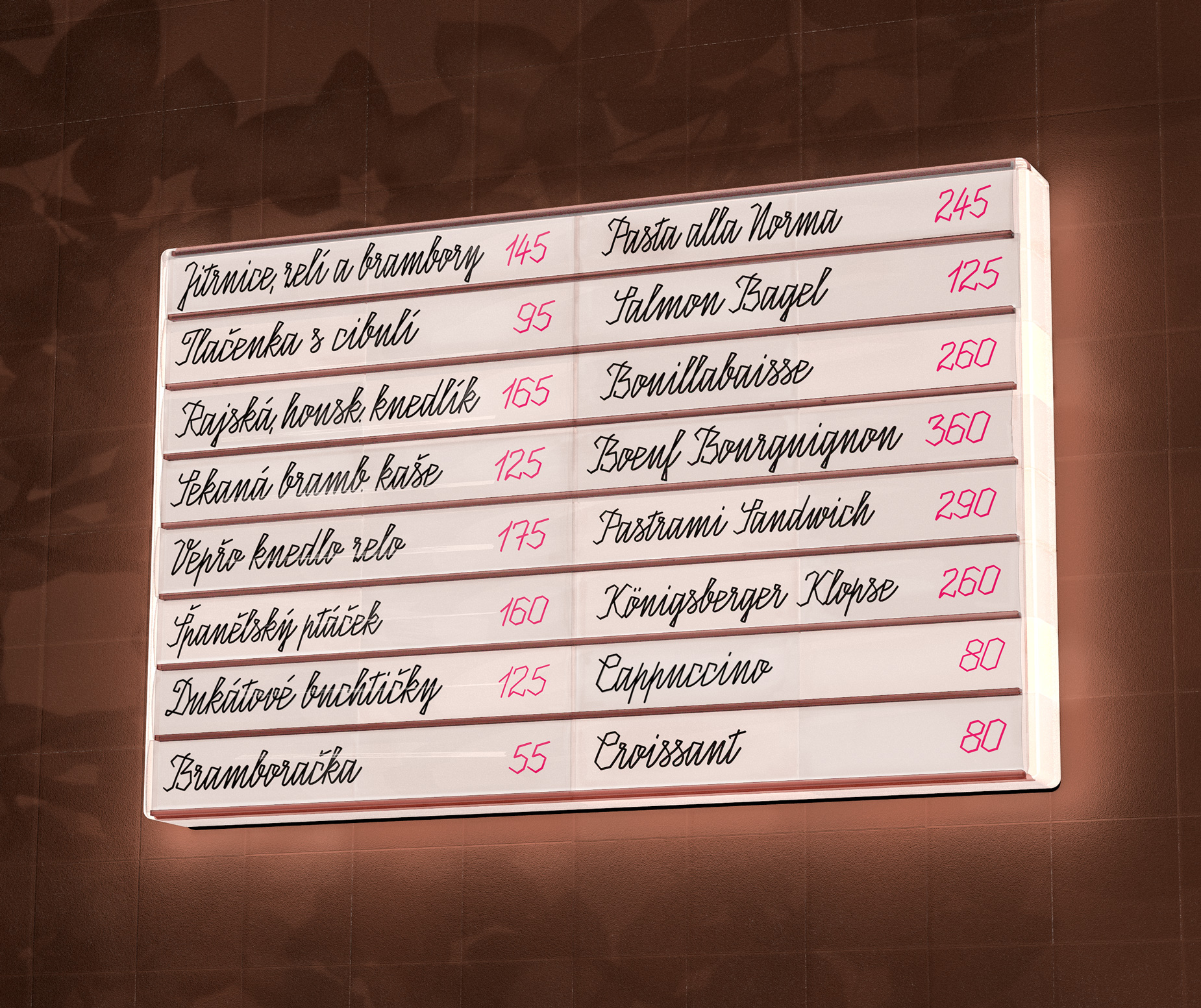
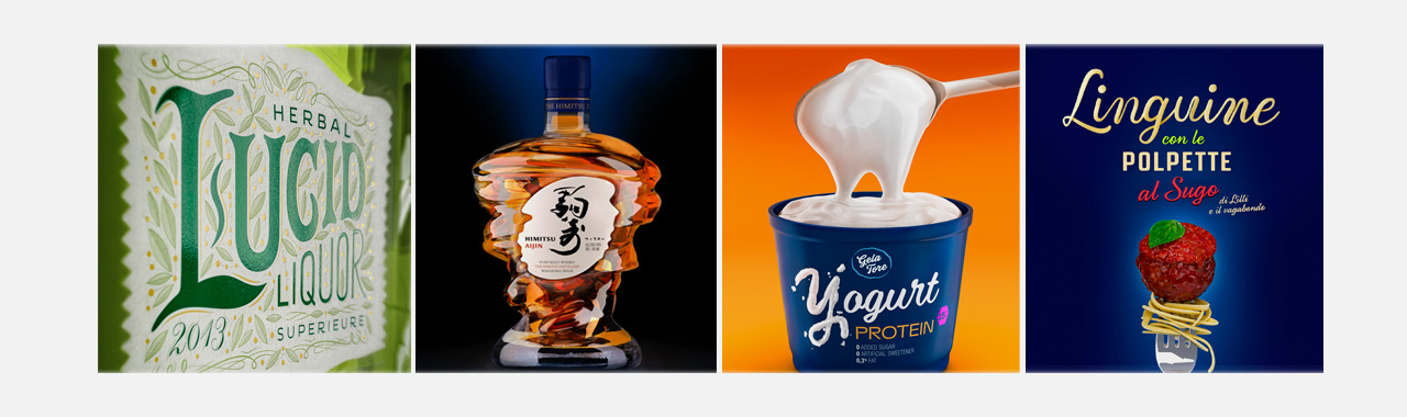
Kablick Script


A distinctive, handwritten, connected, monoline script.

It combines geometric construction with the natural rhythm of handwriting. Sharp angular forms and long straight strokes recall technical lettering and signage found in shop windows and menus of the second half of the 20th century.


Subtle irregularities and dynamic diagonals bring energy into an otherwise precise, almost sterile geometry. This contrast works especially well in technical visual communication and software-oriented visual identities.

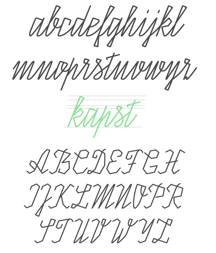
Made to stand out at large sizes, this font creates a strong visual presence for headlines, branding, and bold statements.

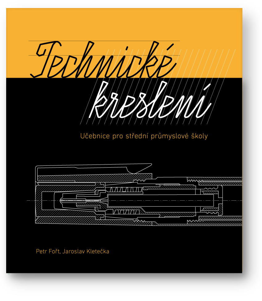
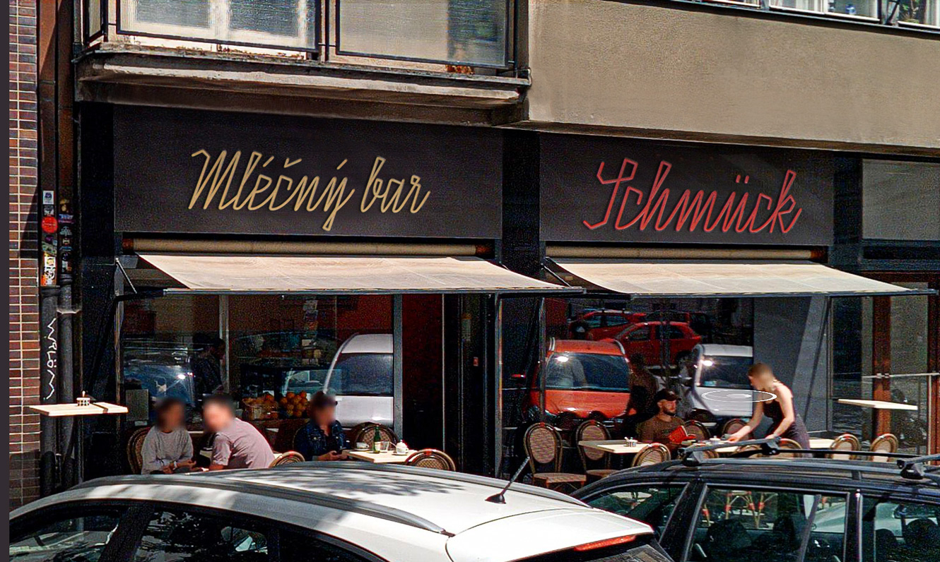
Suitable for packaging, gastronomy, price tags, technical publications and presentations, as well as for projects referencing Central European visual culture of the 1950s–1970s.

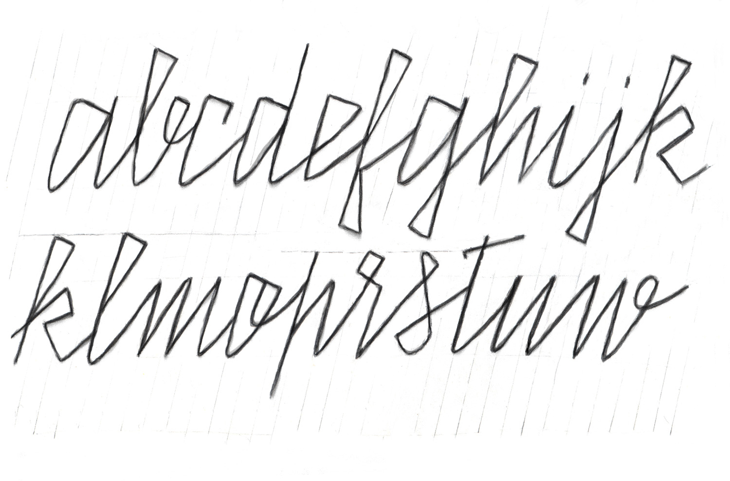
The typeface is still in development. Currently, development focuses on refining the relationship between uppercase and lowercase letters. Additional ligatures and stylistic alternates are being added.


  ↑ TOP
  < BACK
  <  ILUSTRACE

      BUDĚJOVICKÝ BUDVAR  >